
Work price
Designing a piece-rate timesheet app that subcontractors can trust with their pay.
%20(1).png)
Overview
Work Price is the mobile app that turns a paper price list into a working timesheet. It scans the list, tracks every plot a subcontractor is working on, logs the work as it gets done, and outputs a PDF that’s ready for the main contractor by Friday. For UK construction subcontractors paid per piece of work (fitted sockets, lengths of pipe, plots wired), it’s the difference between a Friday afternoon of paperwork and a Friday afternoon at home.
The product worked. The MVP was live, the scan worked, the timesheet came out at the other end. What the app didn’t yet do was behave like a piece of professional kit a subcontractor would keep on their home screen. We were brought in to fix that.
.png)
Opportunity
The challenge
The MVP did the job. Subcontractors could scan a paper price list, set up plots, track their work, and export a timesheet. But the way you got there asked too much. Signup was three screens. Magic features were buried alongside fallback options. Native browser dialogs sat next to custom screens. Domain jargon (plot, house type, work item, extras) was used freely without explanation.
%20(1).png)
Opportunity

Opportunity
The challenge
The deeper issue was trust. Every number this app tracks ends up on someone’s invoice. A first-time user has no way of knowing whether the scan got their prices right, no way of telling whether the totals add up to what the main contractor will actually pay them. The original was optimised for setup speed. It needed to be optimised for setup trust.
The brief was to make Work Price feel like the kind of professional kit a subcontractor would put on their home screen and recommend to the next person on site.
%20(1).png)
Opportunity
What we did
Made the magic feature the obvious path
The scan is what makes Work Price a different product from a spreadsheet. We restructured the create-pricelist screen so scanning was the recommended route, CSV import was for the spreadsheet-savvy, and build-from-scratch was the fallback. Then we added the bits the original flow was missing: a tips screen with do-and-don’t visuals before the camera opens, live edge detection during capture, and a review screen that flags low-confidence cells before the user accepts them. OCR confidence became a first-class part of the experience, not a hidden step.
%20(1).png)
Opportunity
What we did
Designed for outdoors, one-handed, end of week
The app’s users open it in glare, in the cab of a van, with one thumb, often at the end of a long day. We anchored the brand on a high-contrast black-and-yellow palette, a deliberate nod to the high-vis and hazard-tape language of a construction site, pulled into something more refined than literal. Light and dark mode were designed in parallel from the first screen rather than retrofitted later. The bottom navigation was pared to four destinations that earn their place: Home, Plots, Timesheets, and a More menu for everything else.
%20(1).png)
Opportunity
What we did
Built the dashboard around one card
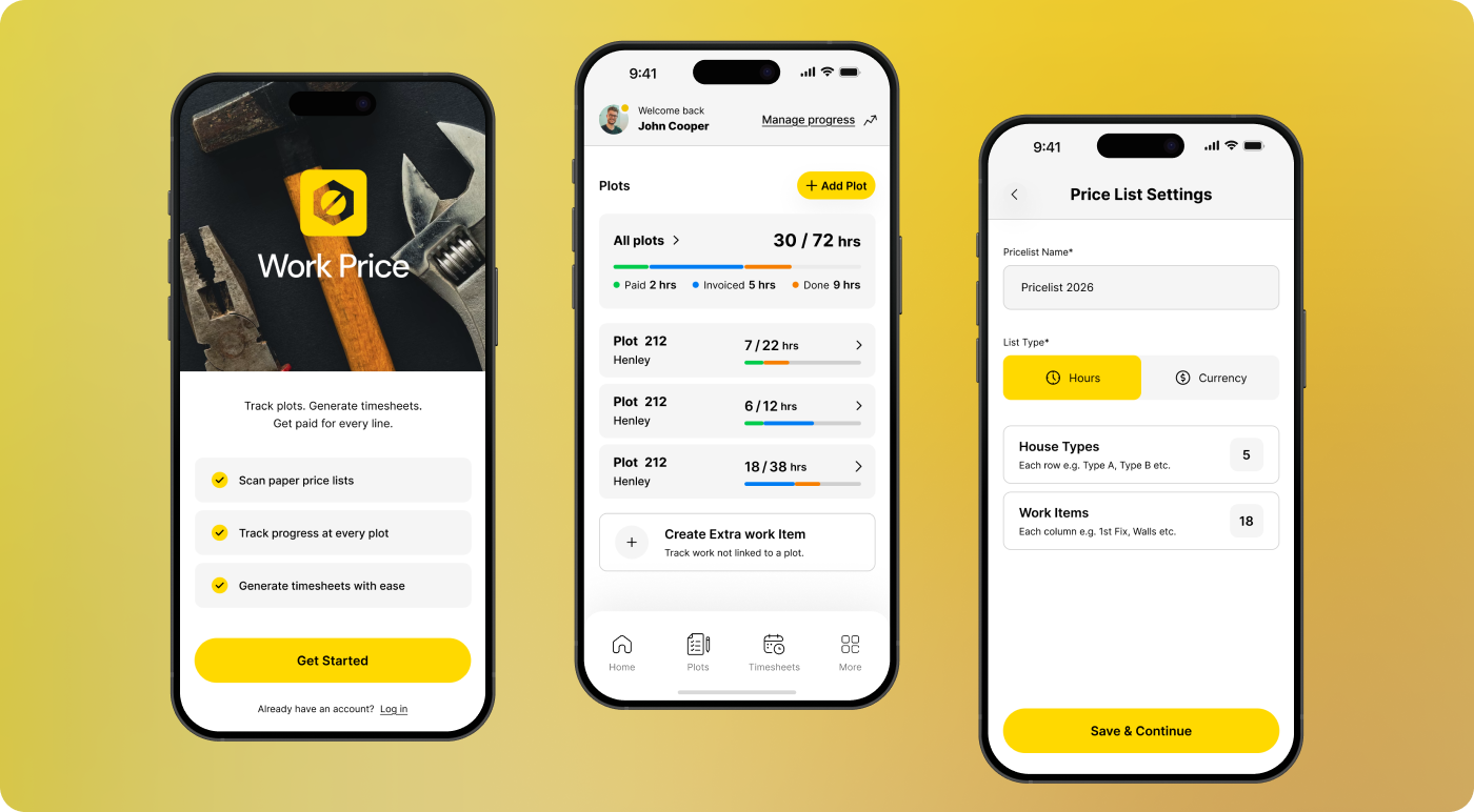
The home screen is built around a single status object: the plot card. In one glance it shows the plot number, the house type, hours logged versus hours available, and a stacked progress bar that splits the work into paid, invoiced, and done. Three pieces of information subcontractors usually compile by hand from paper, unified into a single read. Empty states get the same treatment. First-time users see a one-line definition of “plot” the first time the word appears, and never again after that.
%20(1).png)
Opportunity
What we did
Gave the modals back to the brand
The MVP used iOS-native browser prompts for renaming items and adding house types. The bright-blue dialogs broke the otherwise teal-and-yellow visual language and looked, to a critical eye, like a developer placeholder. We rebuilt every dialog as a branded bottom sheet. Same job, but the app feels like one product all the way through.
%20(1).png)
Opportunity
What’s ready to ship
The redesign covers every screen that gets a new user from a paper price list pinned to a site office wall to an exported timesheet:
Authentication and signup · Three-step intro carousel · Create price list (scan, CSV, manual) · Scan tips, capture and review · Pricelist settings and editor · House types and work items · New plot and plot detail · Log work · Home in empty, populated and post-onboarding states · Branded modal sheets · Menu and settings.
The redesigned flows are now moving from Figma into React Native build. We continue to support Workprice as real user feedback starts coming back from site.
%20(1).png)
Opportunity
Opportunity
Opportunity
Why choose Moken
Workprice had a product that worked and a founder who knew the trade inside out. Our job was to make the design carry the same authority as the product, so a subcontractor opening Work Price for the first time would treat it as a serious piece of kit rather than another app to try and abandon
We worked from UX critique through visual identity into delivered Figma screens, every decision grounded in the daily reality of working on a construction site. The result is an app ready to land on a subcontractor’s home screen and earn the next install the way trade tools have always travelled: by word of mouth on site.
Looking ahead
We continue to support Centric as their marketing needs evolve, ensuring their website remains clear, cohesive and fit for an enterprise audience.


.png)
.svg)

.svg)
.svg)
.png)
.png)
.png)